Colour psychology is a field of study which explores how colours can impact human emotions, behaviours and perceptions of a space. And this isn’t an isolated theory — according to author and expert Karen Haller, colours affect most of us every single day.
By using the principles of colour psychology, you can ensure that each room in your home conveys exactly what you want it to and helps you feel how you’d like to. Your bathroom, for example, can become a haven of calm while your kitchen could become energising and uplifting.
In this article, we explore a range of colours and their psychological associations. Keep an eye out, too, for shade and lighting considerations.
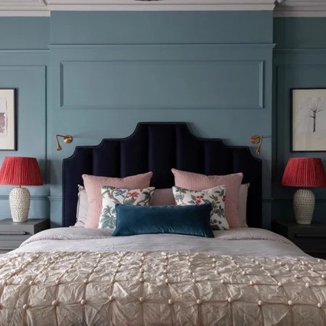
Blue
Blue mind theory developed by marine biologist Wallace J. Nichols suggests that being near water can reduce stress and boost the mood. And the same can be said for being in a room which has large expanses of the colour blue. In fact, one Travelodge study showed that blue bedrooms are the most likely to promote a great night’s sleep.
So, in a bedroom, consider opting for light shades such as aqua or periwinkle to maximise the restful effect. In common areas like living rooms or home offices, consider medium to deep blues like navy or teal which can foster a sense of focus and concentration while maintaining a serene ambiance.
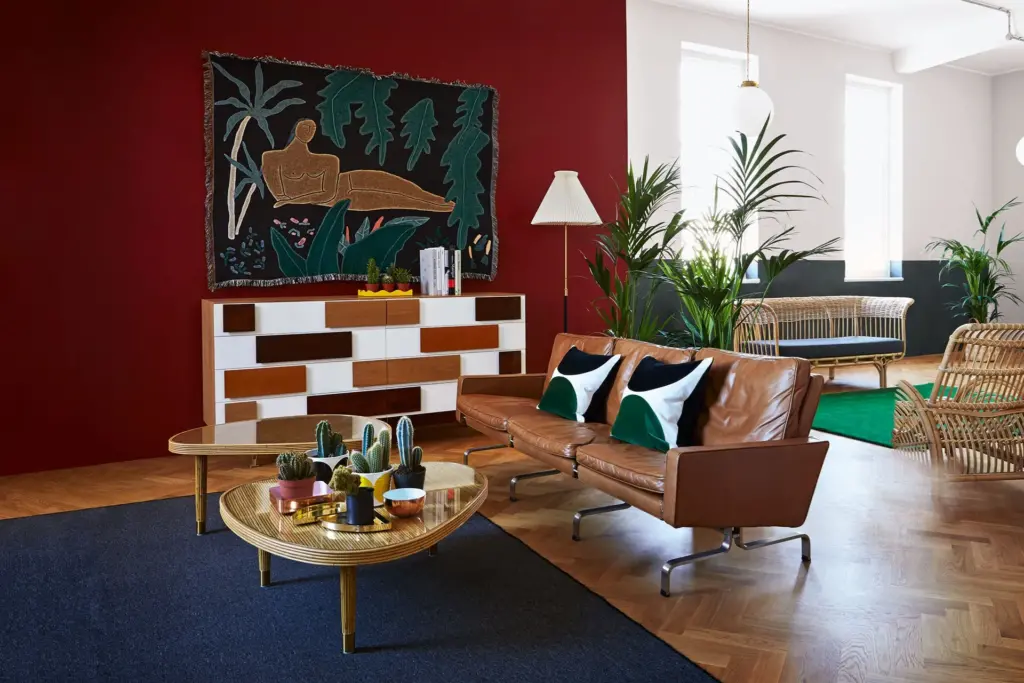
Red
Red is often thought of as a colour which inspires ambition and action. Darker shades might evoke a sense of power and opulence, while brighter hues can convey energy and passion.
Though you should use vivid shades more sparingly, red is a great colour to breathe life into social spaces such as dining areas or entertainment rooms. Consider using deep reds in upholstery, drapes, or statement pieces of furniture to add depth and drama and bright reds in accents and highlights.
You should also consider using ambient lighting fixtures such as pendant lights or chandeliers as these provide warmth and can prevent the room from feeling too dim or enclosed.
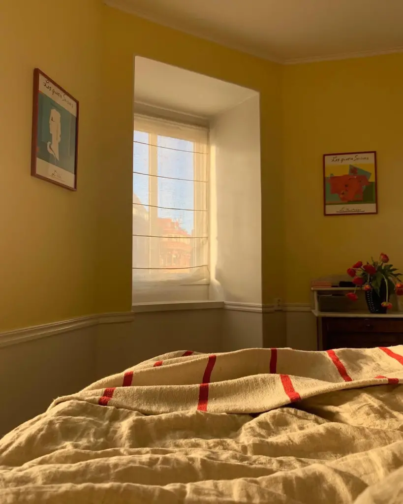
Yellow
As designer Justyna Korczynska describes, “Yellow brings in a touch of warmth and optimism to a room, perfect for bringing a sense of positivity into the home.” It’s a great idea to use yellow to energise living areas and kitchens. Yellow is also a wonderful colour for creative spaces such as children’s playrooms and craft areas.
It’s best to implement bright shades on north-facing walls as the colour can enhance and brighten spaces that receive less natural light. In more well-lit spaces, you can use muddier or earthier tones.
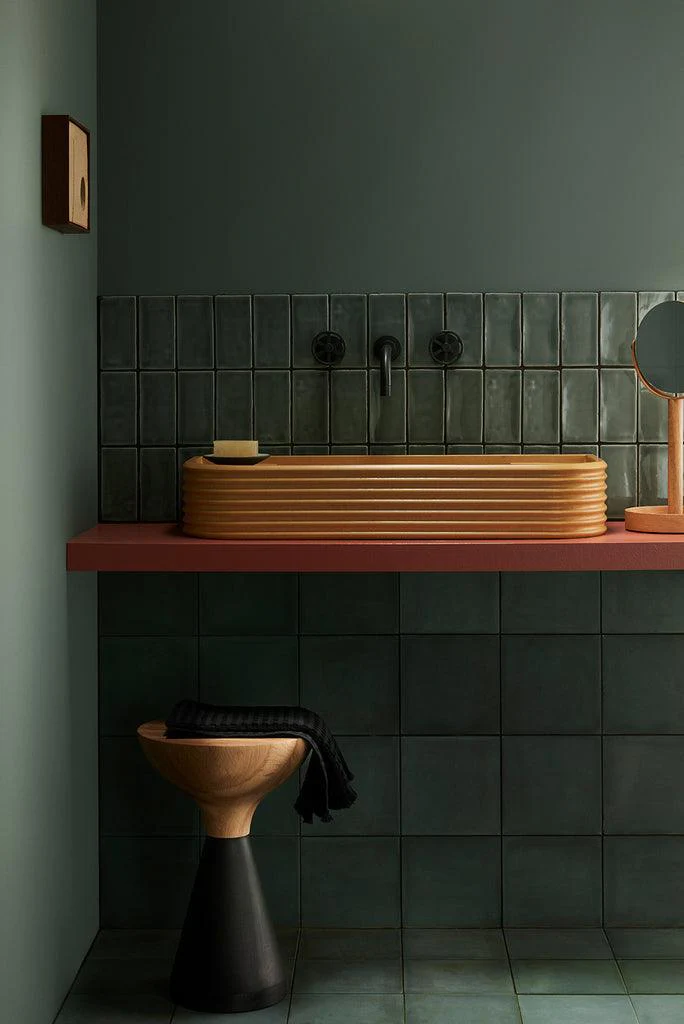
Green
Reminiscent of nature, green revitalises any space. As Karen Haller says in the Little Book of Colour, “It reassures us on a very primitive level. We know we can find food and water, which means green equals life. Using greens in our home, we can bring in these feelings of rest and reassurance.”
When using green in a space, consider adding warm lighting to enhance the organic feel. You should also pay attention to shade – lighter greens can make a space feel more open and airy, while darker greens can create a cosy and intimate ambience.
Pink
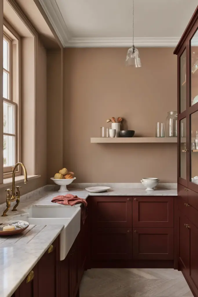
As Interior Designer, Natalie Tredgett describes, “Pink evokes the feeling of softness; it is also a colour that is intrinsically linked to nature and flowers… It calms us.” And it’s true — pink is even famously used in prisons because it’s said to make the inmates less aggressive.
Soft and muted hues such as blush or pastel tones are best for infusing a space with a sense of gentle warmth and tranquillity. However, deeper pinks like fuchsia or magenta can still play a beautiful role in your interiors, injecting vibrancy into living spaces and dining areas.
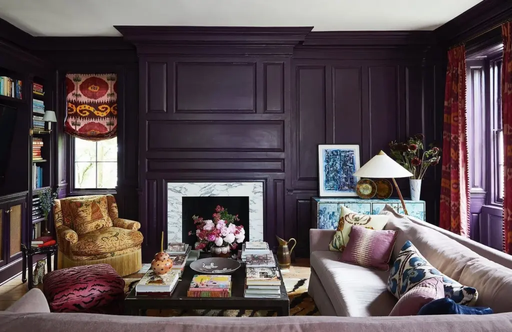
Purple
Since it’s a shade that occurs rarely in nature, purple is viewed as mysterious, regal and even spiritual. You can use darker shades to elevate communal areas, adding a touch of luxury or incorporate lighter shades (such as lavender) to bring a sense of calm elegance to bathrooms and bedrooms.
For the former, opt for warm lighting fixtures to enhance the regal allure and for the latter, choose soft, diffused lighting sources such as bedside lamps to create a tranquil environment.
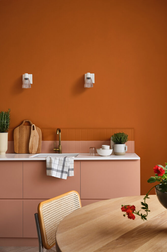
Orange
Nothing adds warmth and character to a space like the colour orange. To avoid overwhelming the eye, opt for rich shades like tangerine and pumpkin orange in accents or feature walls and deeper tones elsewhere.
You should also choose warm-toned fixtures to complement the richness of the orange hues. Pendant lights and table lamps with warm bulbs can create a welcoming atmosphere and highlight the colour beautifully.
For optimal paint application
Elevate your space with high-end painting and decorating from SV Interiors. Get in touch today to find out more.